

The Totem-pole Model of Page Design
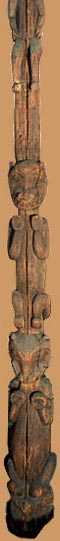 Don't Do This: There are many examples, like this
one, on the Web of pages that follow the totem-pole model of
page design: centered, vertical, one-thing-at-a-time.
Don't Do This: There are many examples, like this
one, on the Web of pages that follow the totem-pole model of
page design: centered, vertical, one-thing-at-a-time.
Instead, use
- enough verbal and pictorial content to fill out the page horizontally
- don't center everything (note the jagged profile that centering gives to the content--the design shows no clean lines)
- invisible layout tables to pour content into to create a more horizontal layout (note here the column on the left for navigational links. See Towers' book Dreamweaver 4, page 272
< Back to the Ideas Site home
Please contact me about any broken links or errors, or if you have suggestions for additional links on this page.