Techniques
Home
Craig's Homepage
Ideas Site
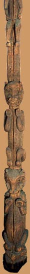
Call it the Totem-Pole Model of Page Design.
As you add items to a blank page in HTML, they naturally stack up in a design that's
On the other hand, we usually want to use HTML to create pages that look like slick magazine layouts or TV screens.
We usually don't like to scroll down to see what a page has to offer.
We sure like pictures, but not the wasted white space trapped off on the right side.
Centering everything has its own problems.
Centering gives the content a jagged profile on the left and right that's harder to read because the layout has no clean lines.
Centering also makes it harder to group items that belong together because you're working in only two dimensions.
Centering often means
you're wasting
space on both the left and right sides
especially with
![]()
small pictures, and
lists
lists
lists
lists
Not to mention short paragraphs.
The Answer?
Horizontal Page Design
Use invisible layout tables to corral your content so it can be laid out in a design that
Try re-laying-out the content of this page in a horizontal design. See how much of the most important content you can get in the first screenful, and how little scrolling your revised page will require.
Part of the challenge is to decide what goes with what on the page. Corral like elements together in cells, and separate them from elements in the other cells. White space should flow around each set of like elements to highlight the structure and meaning of the content, rather than being "trapped."
Nielsen's Celebrating
Holidays
Ethics of
Labeling and Granularity
UMD Student Web Contest