
Project Assignment
Using principles from Edward Tufte's book Visual Explanations, create an informational graphic that makes a point or argument by visualizing a set of data. In essence, this graphic will both present the data (with numbers and words), visualize the most relevant relationships among that data (e.g., distances, locations, time, change, etc.), and make an rhetorical argument to a particular audience.
See some examples (if not models):
- Lost character timeline
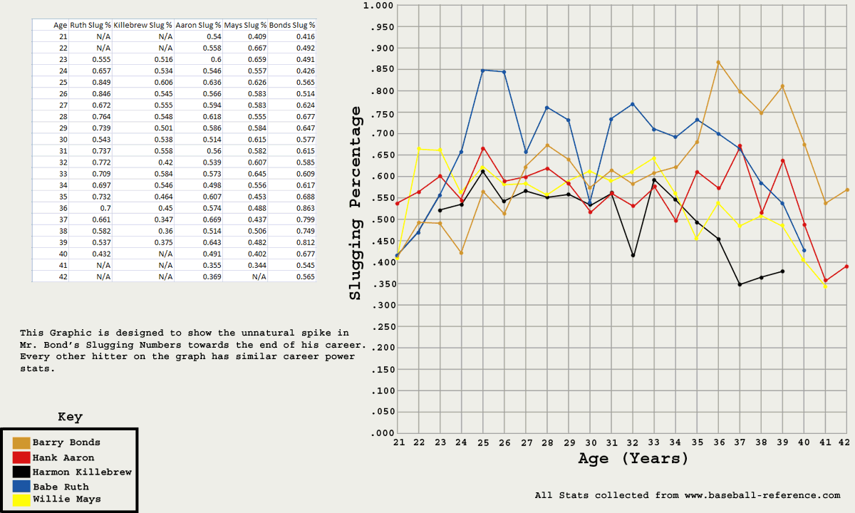
- a student project on Barry Bonds
- Distribution of Income by Religious Belief
Criteria
Conception
- the extent to which the project visually interprets, explains, or illustrates a set of data
- that the topic is complex or difficult enough genuinely to require an explanation
- that the project speaks to the needs or interests of an actual audience: giving directions; revealing causes; showing the relationship of elements for improved understanding, planning, use, or remembering
Analytical Design
- the extent it reveals the dynamic and meaningful relations of variables, causes, considerations, or stages which make significant comparisons visually apparent.
- the degree to which these comparisons or relations are purposeful, presenting a thoughtful argument, telling a revealing story, or making a substantive point.
- the degree to which the graphics help the audience see layers of information: multiple variables or subtle techniques.
- the extent that the graphic(s) communicate quantities--that is, include numbers, distances, times, etc. as appropriate
- that the project uses Tufte's three techniques of direct labels, encodings and self representing scales (page 13)
- whether or not the variables include 20 data points (10 instances of 2 variable, for instance)
- how well presented and maintained the sense of time, sequence, or cause-and-effect is
Presentation Format
- how well a short introduction effectively explains the contents and purpose of the graphic, as well as suggesting whom this graphic is intended for and why
- whether all quantities are repeated in a table for easy reference, and that the sources of the data are documented clearly
- that the data is also available in an Excel spreadsheet saved in the same web folder ("visualized"). Be sure to include a link to the spreadsheet in the Moddle forum.
- how well the graphic(s) and supporting page(s) function
- how consistently the images display and how well optimized they are to be small files that download fast and display clearly and with correct proportions
- that the page design is technically stable in a variety of browsers
Commentary
- how thoughtfully the project is analyzed in a in a formal, well-written, grammatically correct commentary of at least 500 words (about 2 double-spaced pages), speaking to the criteria above
- how well the commentary compares the project's purpose and method with at least two of the examples of visualized data discussed in class, either in print or online (including those your classmates found and included in the online forums)
- that the commentary thoughtfully employs--and elaborates its use of--the critical vocabulary from Tufte or from other class materials at least four times. The use of these terms should be productive and seem natural, rather than forced and mechanical. Please format these critical terms in bold.
- that the commentary thoughtfully employs two quotations from the Tufte chapter, and that these quotations lead to genuine insights into the project
- whether all outside references in the commentary--including online ones--are cited correctly using MLA-style in-text citation format and bibliographic documentation at the end of the commentary
Key Terms that Apply to This Project
- rhetoric: Artistotle defined rhetoric as "the faculty of observing in any given case the available means of persuasion."
- visual rhetoric
- data points
- documentation
- direct labels / encodings / self-representing scales,
- informationally flat or rich graphics (The Onion homelessness example)
- dequantification / quantification (severe storm example)
- the art and science of scaling (sunspot example)
- variables
- displaying causality (cause and effect) vs. descriptive narration
- aggregation (of data)
- evidence (vs. numbers)
- selection of data (defining terms of the decision)
- chartjunk
- order
- enforcing comparisons
- "multivariate" nature of analytic problems
- "precise seeing is precise thinking"
Resources
Some Sources for Data
- Swivel
- Pew Research Center
- NationMaster
- StateMaster
- Google Trends
- Worldmapper
- FedStats (Gateway to US Government Federal Statistics)
- UMD Library's Databases by Subject
- MLA guidelines for in-text citations
- Re-Visions of Menard